The Art of Therapy: Relaxation Techniques and the Role of Color in Art Therapy
The Art of Therapy: Relaxation Techniques and the Role of Color in Art Therapy
If you missed last week’s blog, we discussed how art as a therapeutic method can be greatly beneficial and deeply effective in personal growth, development, and healing. It can play many different nuanced roles within a therapeutic context, sometimes acting as more of a relaxation device, a method of restoring a sense of control, an outlet to express in freedom, or a way of confronting, exploring, or accepting the self.
As a tool for relaxation, art has many different methods to offer. In fact, Mandala style adult coloring books have become increasingly popular for this very reason. Mandala designs that are more complex force the artist into a more mindful and present state of consciousness because they require more intent focus in order to complete. Less complex designs allow the artist to enter a mind-quieting state, where their minds can wander at will while their hands are kept busy. This allows the individual to reflect on past or present events and process internally, while still expressing outwardly in a healthy manner. For some, simply spreading colors on paper can be very relaxing and fulfilling, whether it’s paint, colored pencils, pastels, or watercolors. Others might enjoy sticking to a monochrome palette and exploring different textures, shapes, and designs. Another art medium that lends itself well to relaxation therapy is sculpture! Sculpture can initially sound very intimidating, but it doesn’t have to be; in fact sculpture can be as simple as playing with Play Doh, or the next level, air-dry clay. Sculpture as a therapeutic process is very physical, more so than most other forms of art, which allows for individuals to lean into the mind-body connection, expressing feelings both through art and physicality. The practice of forming, shaping, and molding clay into new structures can work to alleviate the physical effects of stress and tension held in the body, while the mind is also occupied in giving form to something previously formless.
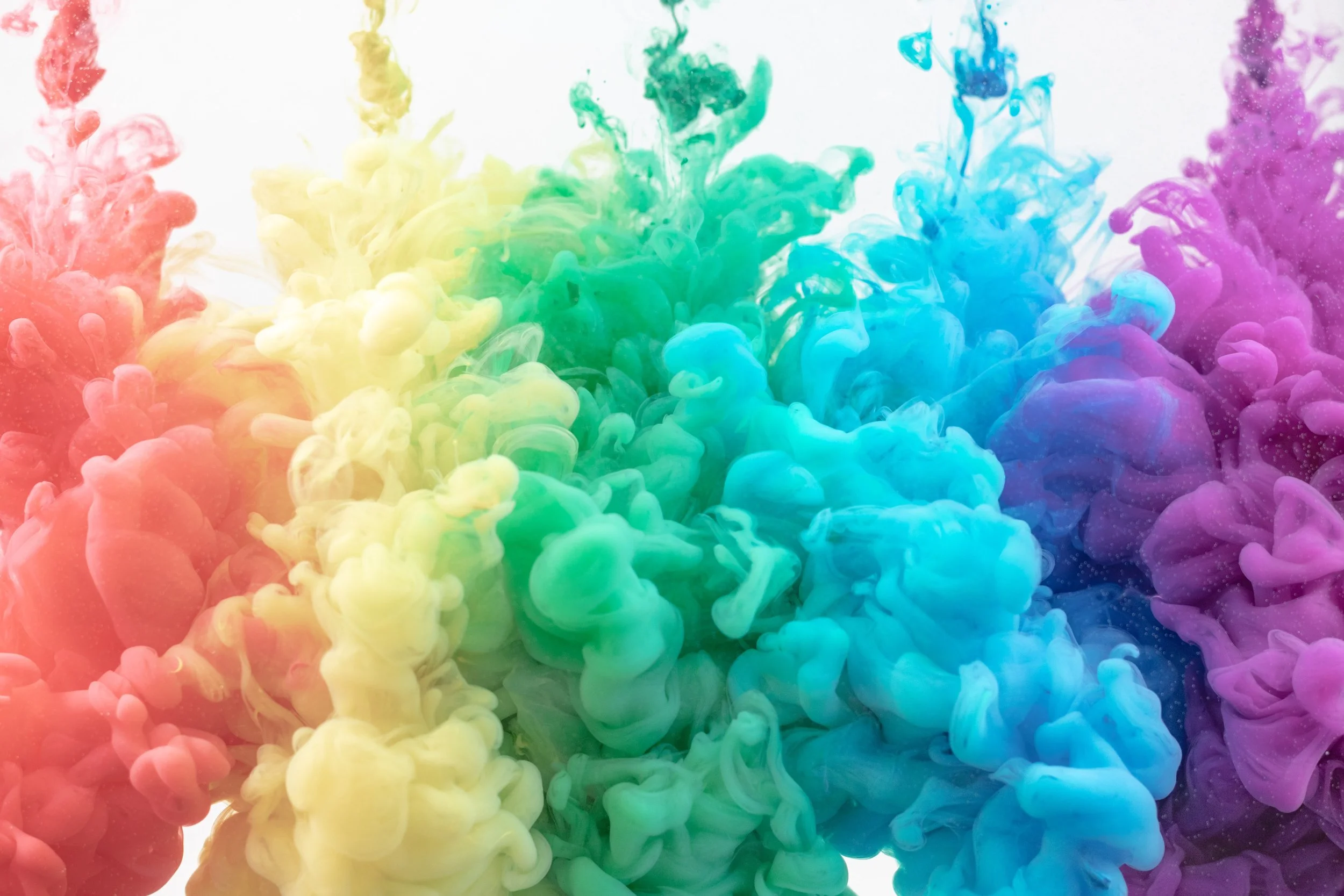
Color plays a huge role in art, and thus in art therapy as well. Color theory is key to producing images that evoke emotion in the viewer (and express it for the artist); certain combinations are naturally more pleasing to the eye, others are always grotesque and off-putting. In color theory, there are a few combinations necessary to understand: primary colors, secondary colors, complementary colors, and analogous colors. There are many more subsets and groupings, but these are the basic building blocks. Primary colors are those which cannot be formed by mixing other colors, specifically, red, yellow, and blue. Secondary colors are all the other colors which are made by mixing primary colors, such as orange, green, and purple. Complementary colors are colors opposite each other on the color wheel and naturally are very striking and pleasing to the eye when put together, such as orange and blue. And analogous colors are colors right next to each other on the color wheel and have similar hues and tints, such as blue and purple. What may be less well known is that certain colors under certain contexts can be associated with specific emotions. For example, red is often associated with either anger and fear or love and passion. Blue is often associated with either sadness and melancholy or peace and relaxation. Yellow is often associated with joy and happiness. This means that for some, simply putting color on paper is enough to express pent up emotion and find release. For others, color adds emotion to imagery to either contrast it, showing discomfort, or to give it more depth and embodiment. When color is added to a formerly black and white image, it is often metaphorically understood as “coming to life.” However, if the wrong colors are added to an image (like a black and red forest scene or a pink and yellow skull and crossbones), it can have the effect of being even more unsettling than a dark image with the correct color scheme. These are just a few ways that color contributes to art as a therapeutic process.
We mentioned last time that one of our guests here on Good Life TV, Joni Eareckson Tada, has spoken consistently about the role of art as a therapeutic process in her life. In fact, when we interviewed her she showed us the first art piece she drew after becoming a quadriplegic. The drawing was a pencil sketched face of anguish and suffering. What was fascinating to learn is that, to this day, it was still her favorite piece. Joni shared that she was so attached to this piece because it was so representative of not just her in that moment, but of “all of humanity at one point or another.” No one on this earth is immune to pain and suffering, but we are in it together. Joni is a strong advocate for hope and overcoming, but she understood that even though hope is powerful, brokenness is still real. In order for healing to come, brokenness must first be acknowledged and expressed–and art is an incredibly powerful tool with which to do so.
To learn more about Joni and her story, watch her interview here and visit her website here. To continue learning more about art as a therapeutic practice, how it is done, and some of the research behind it, keep your eyes open for our next post!

